
The thought of building an app can be a terrifying concept, never mind getting down to the nitty-gritty of actually developing one. Are you looking to implement new technologies in your business? Let Bourne Digital take the horror out of it with SAP Fiori.
Following on from our recent Enterprise Mobility event in Sydney, SAP has recently announced its new updates and features for SAP Fiori for Android 6.0 and iOS 9.1. We’ve summarised these points below.
New in SAP Fiori for Android 6.0
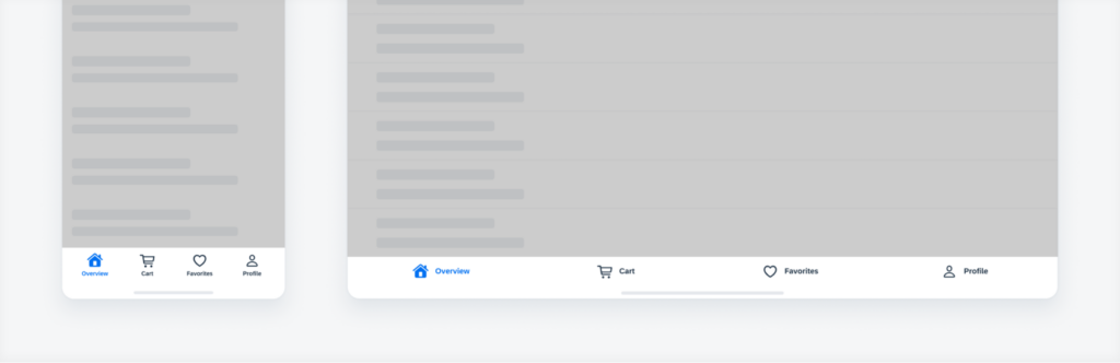
Navigation Bar
Introducing a new UI component, making it easier than ever to switch between the main pages on their mobile app. The navigation bar uses 100% of the screen width and the destinations are equally distributed across the navigation bar. When scrolling up or down on the screen the navigation bar remains fixed. There are different variations of destinations to represent the navigation bar: label and icon, icon only, and mixed.
Navigation Drawer
The navigation bar provides access to different destinations in an app. This can be permanently visible or opened and closed by tapping a menu icon. Use the modal navigation drawer in combination with the navigation rail when there are secondary destinations or actions that don’t belong in the navigation rail. Variations include a modal navigation drawer and a standard navigation drawer.
Navigation Rail
The navigation rail provides navigation to three to seven core destinations in an app.
Data Table Card
This new feature enables you to preview current and historic data in a table format. When tapped, the data table card navigates to a full-screen data table or another defined location.
Onboarding
Improvements to existing UI components and new features, including an onboarding pattern update.
Banners
Used to show a short message that displays at the top of the screen. Banners must remain on screen until dismissed by the user. Variations include one-line text, two-line text and three-line text.
Data Table
A grid layout of columns and rows showing labelled data like numbers, text, and images. The header stays at the top as the user scrolls. The user can tap any row to see the row details in a key object cell view.
Progress Indicators
Inform users about the status of ongoing processes, such as login progress, uploading files or refreshing content. Progress indicators should be used if the wait time takes longer than one second.
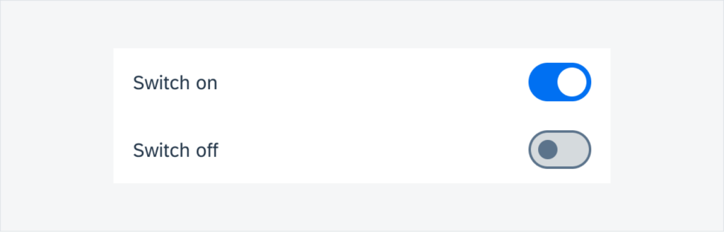
Switches
Mimics a physical switch that allows users to turn individual settings (such as personalization or display settings) “on” or “off”.
New in SAP Fiori for iOS 9.1
Quick Sort
A contextual sort pattern that allows users to change the sort criteria of a component. On an iPhone in compact width and an iPad in regular width, quick sort uses the default iOS menu and submenu. If users need to take several actions within a component or fullscreen view, they can access the quick sort criteria in the submenu.
Semantic Buttons
Now available on iOS. The tint button style can emphasize available actions and encourage users to interact. A negative button style is available to warn users of destructive actions.
Tab Bar
The tab bar uses tab items to navigate between mutually exclusive panes of content at the same level of hierarchy within the same view.
Navigation Bar
Used to indicate the position of the user within the app.
Stepper Form Cell
A control that displays and allows users to incrementally increase or decrease a select value.
Switch Form Cell
Used to toggle two mutually exclusive states: on and off. There is also the option to have a switch with further information.
Slider Form Cell
Displays a continuous range of values along a track. Predefined minimum and maximum values, users can use their fingers to slide the handle along the slider’s track.
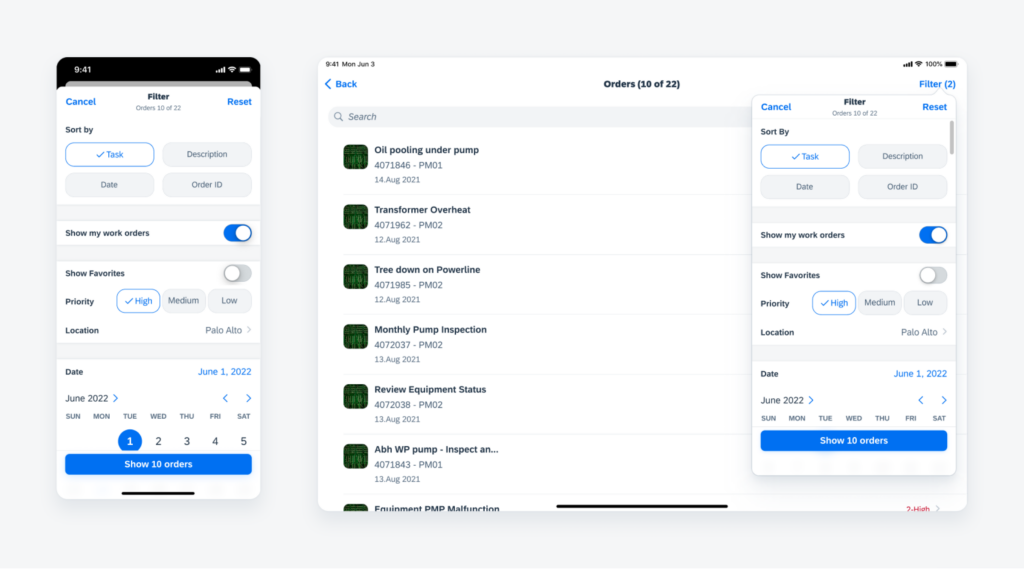
Sort and Filter Form
Used for advanced filtering. Enables the user to maintain the context of the displayed results.
Analytic Data Table Card
The chart card displays a thumbnail view of a chart, with key information shown.
Data Table
A data table is a range of labelled columns and rows used to present numbers, text, or even images. Ability to edit and add data rows.
Empty State View
Used when mobile apps do not have access or cannot show data. Used as a fallback to provide users about what happened and what to do next.
Timeline View
Displays a list of items such as tasks, events, or meetings in chronological order. Shows the most important information about the object,
Timeline Preview
Provides users with a glance at upcoming objects, events or posts. The objects here are read-only.
Toolbar
Located at the bottom edge of the screen, and is a fixed component. Its main use is for closing or finalising actions that impact the current view.
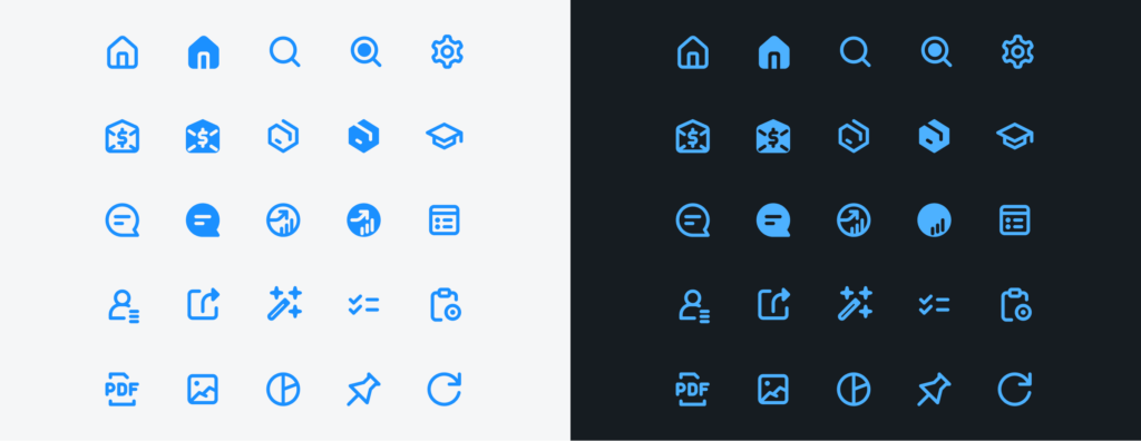
Iconography
Icons have been redesigned on both Android and iOS. These new icons maintain consistency across size, stroke and visual balance, while also being easy to understand.
Best practices for designing an app in Fiori
- Use model-view-controller architectural pattern (MVC) – can provide a more structured, maintainable, and scalable application that meets SAP Fiori design guidelines.
- Use formatter functions for UI-specific logic – can improve the maintainability, reusability, consistency, and flexibility of the application, while also making it easier to test and debug.
- Use XML for defining your views – can improve the maintainability, standardisation, flexibility, reusability, and design of the application’s UI, while also providing a user-friendly way of creating and modifying views.
- Define models and routes in your manifest.json file – can improve the maintainability, consistency, efficiency, reusability, and simplification of the application’s configuration.
- Use i18n for all texts in your application – can improve the accessibility, consistency, centralization, reusability, and efficiency of the application’s text content, while also providing a user-friendly way of managing and localising it.
For further information on these new features, you can read more: